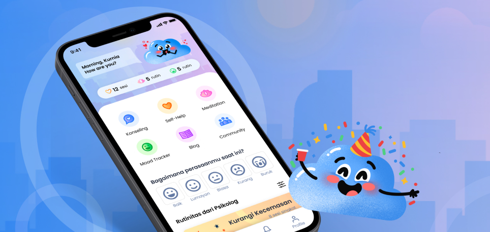
Background
Tanjong Rhu
UI/UX • Website • Shipped
I had a blast working with Tusitala, a Singaporean digital storytelling studio that creates novel literary experience. I designed an interactive microsite presenting the story “Tanjong Rhu” by Minfong Ho, as part of the series little red comma comissioned by Esplanade — Theatres on the Bay. The audio of the website is produced by ArtWave Studio.
View the live site HERE
Client
Role
Freelance
UI/UX Designer
UI/UX Designer
Timeline
November 2022
Overview
About
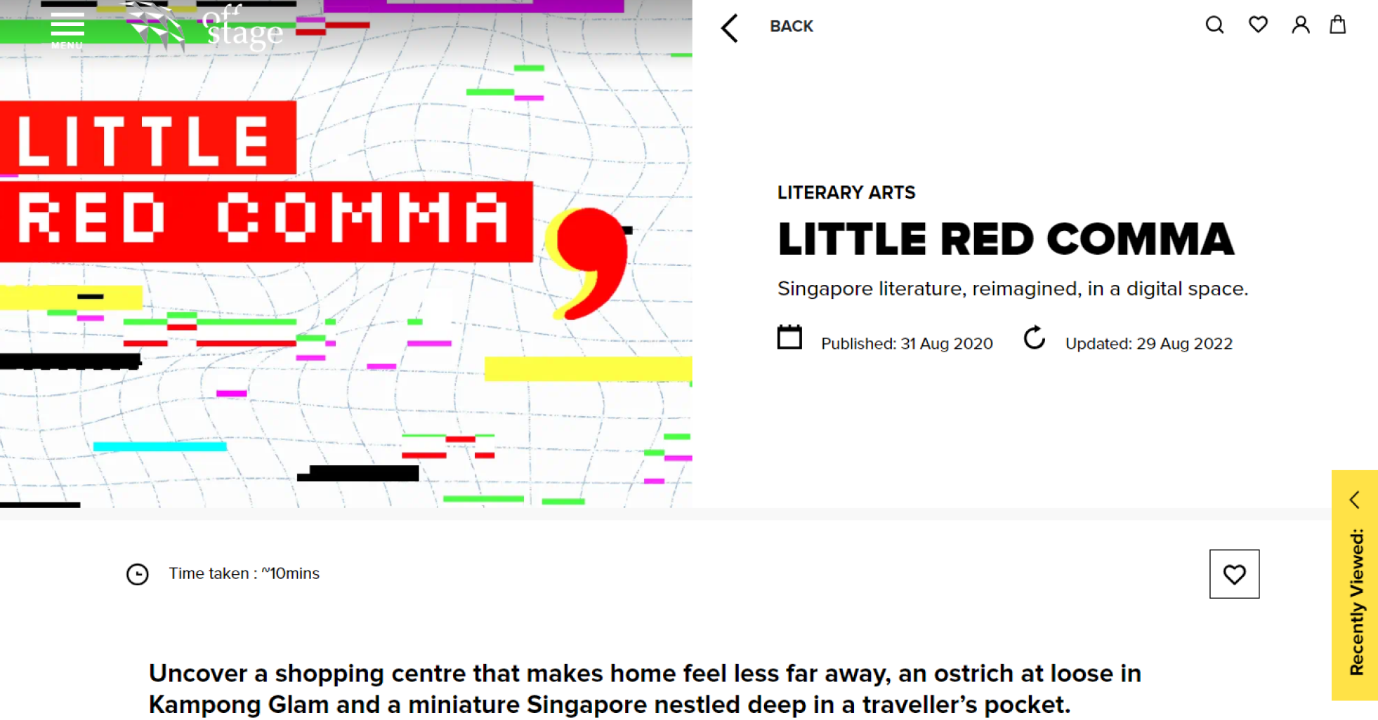
little red comma is a series that publishes seven works of poetry and short fiction, identity and belonging are indelibly associated with physical landmarks, by turns whimsical, fraught, always evolving and deeply felt.
It fuses Singapore literature with digital media, comprising digital adaptations of diverse works by established and emerging homegrown writers as well as literary pioneers. Featuring original soundscapes, audio readings and illustrations by local artists and creatives.
My Responsibilities
As a freelance designer...
This project was quite fast paced, I had to work from scratch based on the brief provided and conclude the project with a working prototyping to be handed over the web developer.
Debunking the brief
After going through the brief, I listed a few questions to enquire the studio team to gain better understanding on Singapore culture and audiences.
Design & design system
I designed lo-fi and hi-fi frames on both mobile & desktop interfaces. Creating an entire design library for both screen sizes. The design system had also included various visuals which are to be used as an interaction in the story.
User testing & iterate
While the user testing is arranged and held by the studio, my role as the designer was to take notes and continue to iterate the interaction experiences that were tested based on the results.
Handover to web developer
I worked closely with an in-house web developer to bring the site to live. Else than the working prototype, I also prepared notes, code reference, and animation videos for a clear and efficient communication.

End results
Live Website
Here are some snippets of the interaction and visuals.
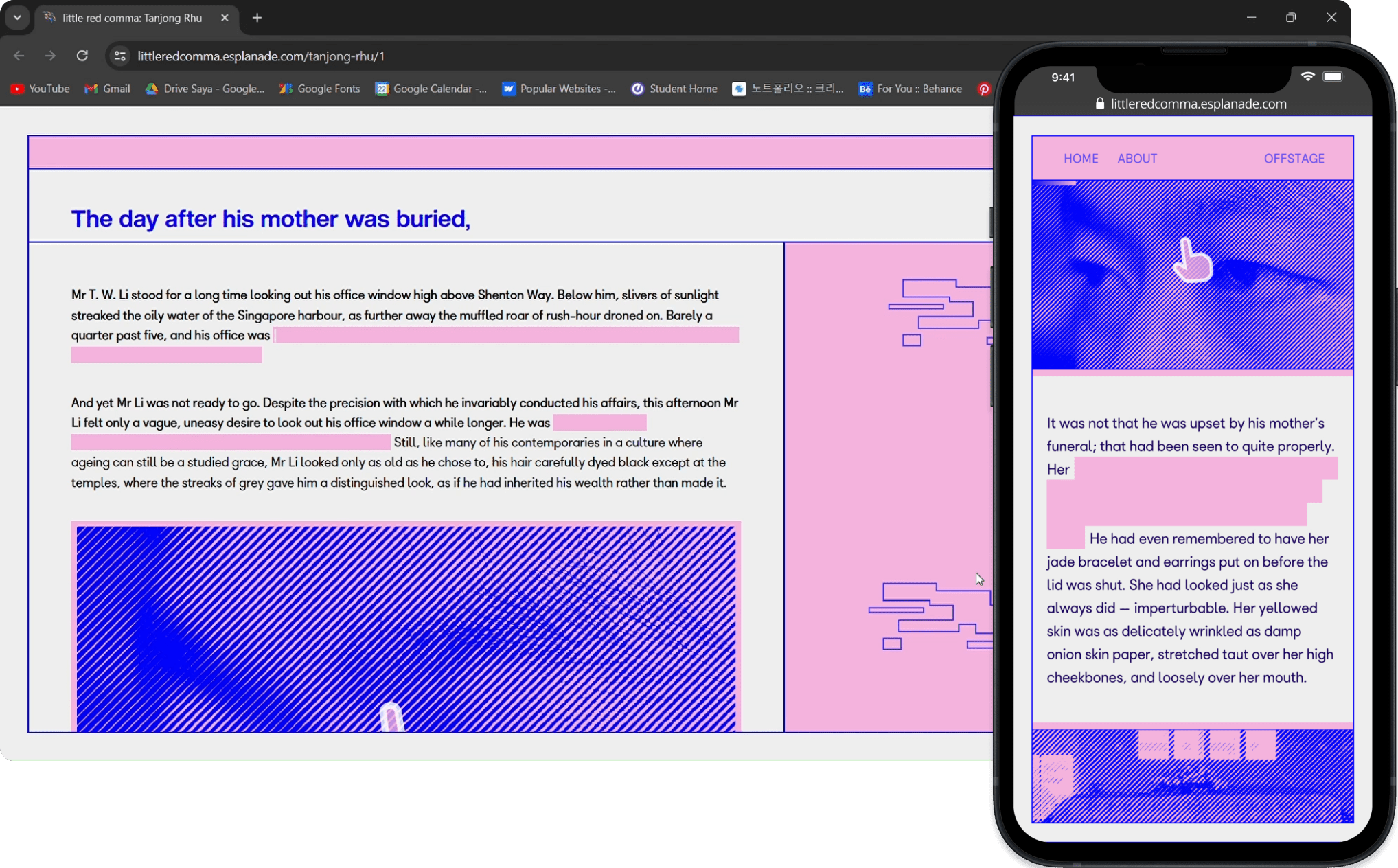
Text reveal
& image click interaction
& image click interaction
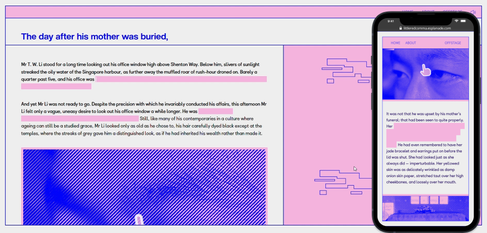
Readers progress through the story by revealing the hidden text and interacting with the image.
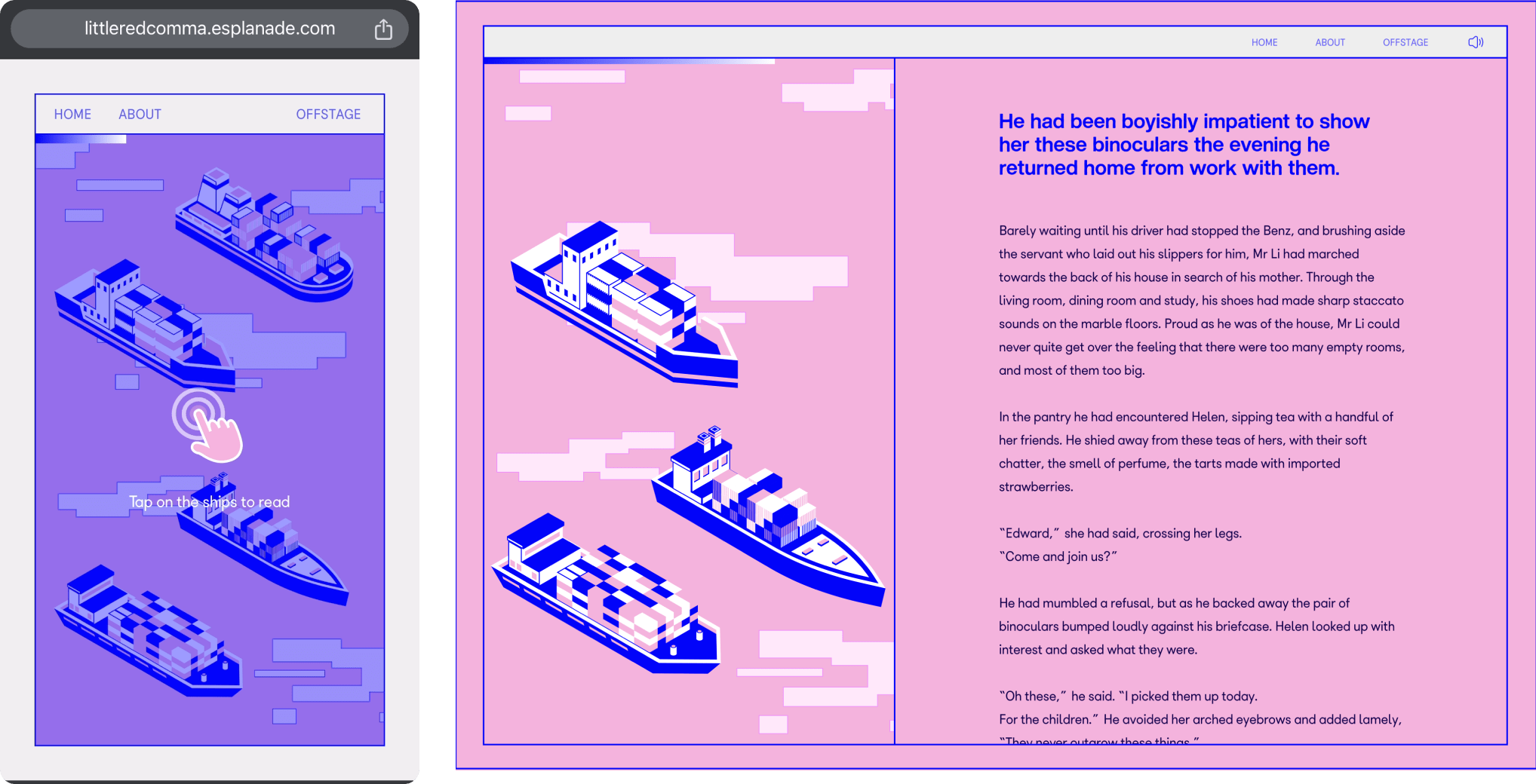
Click to open a part of the story
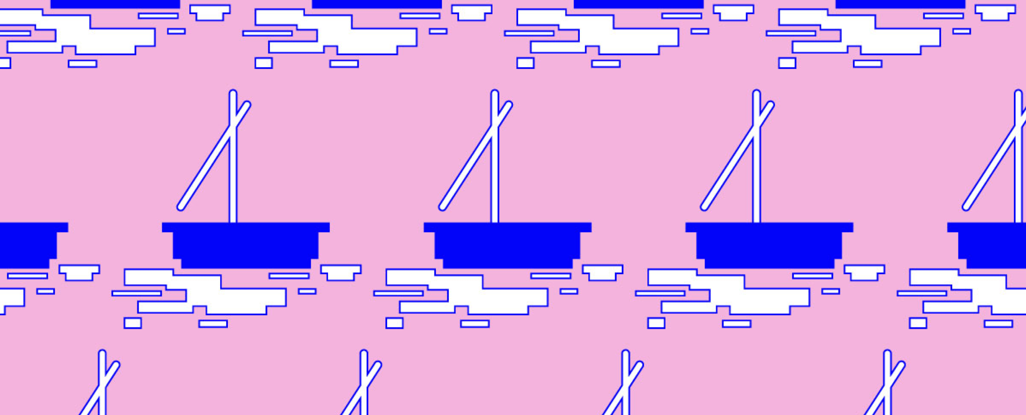
When readers click on a boat, an animation will play out and bring the readers to another of the story.
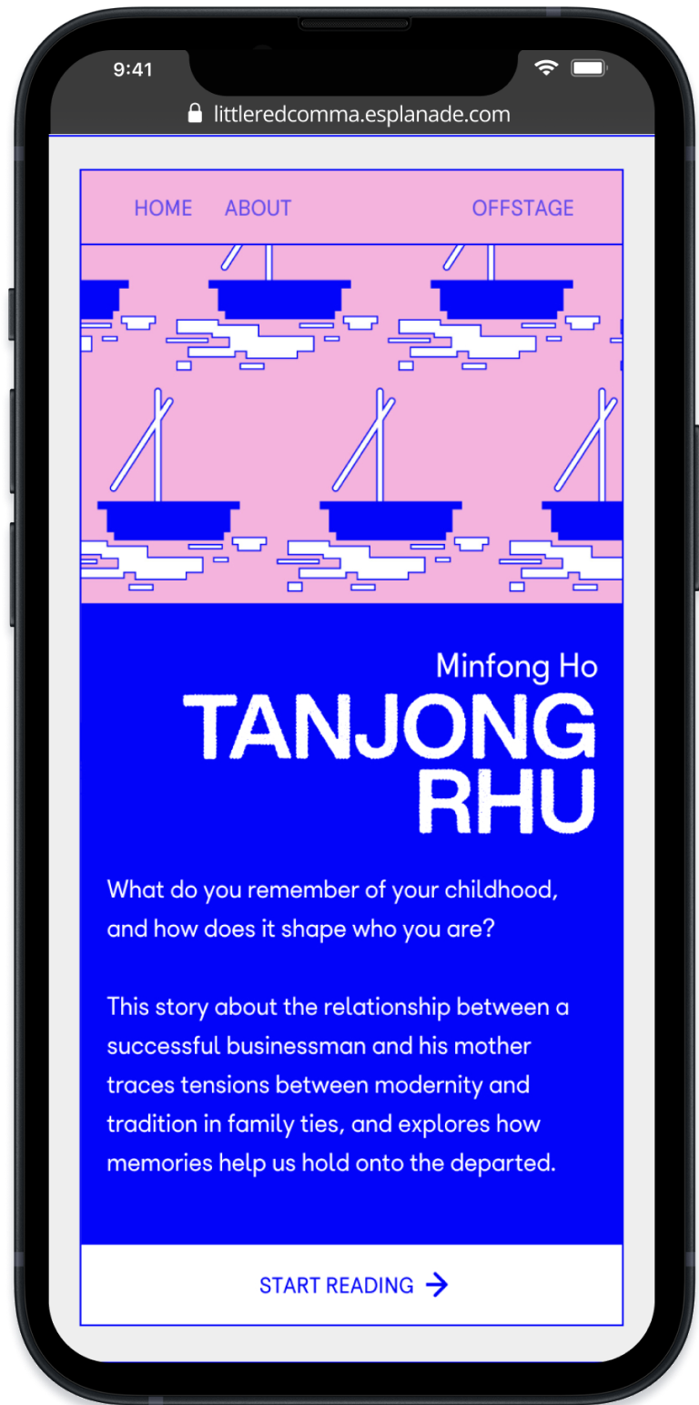
Mobile landing page
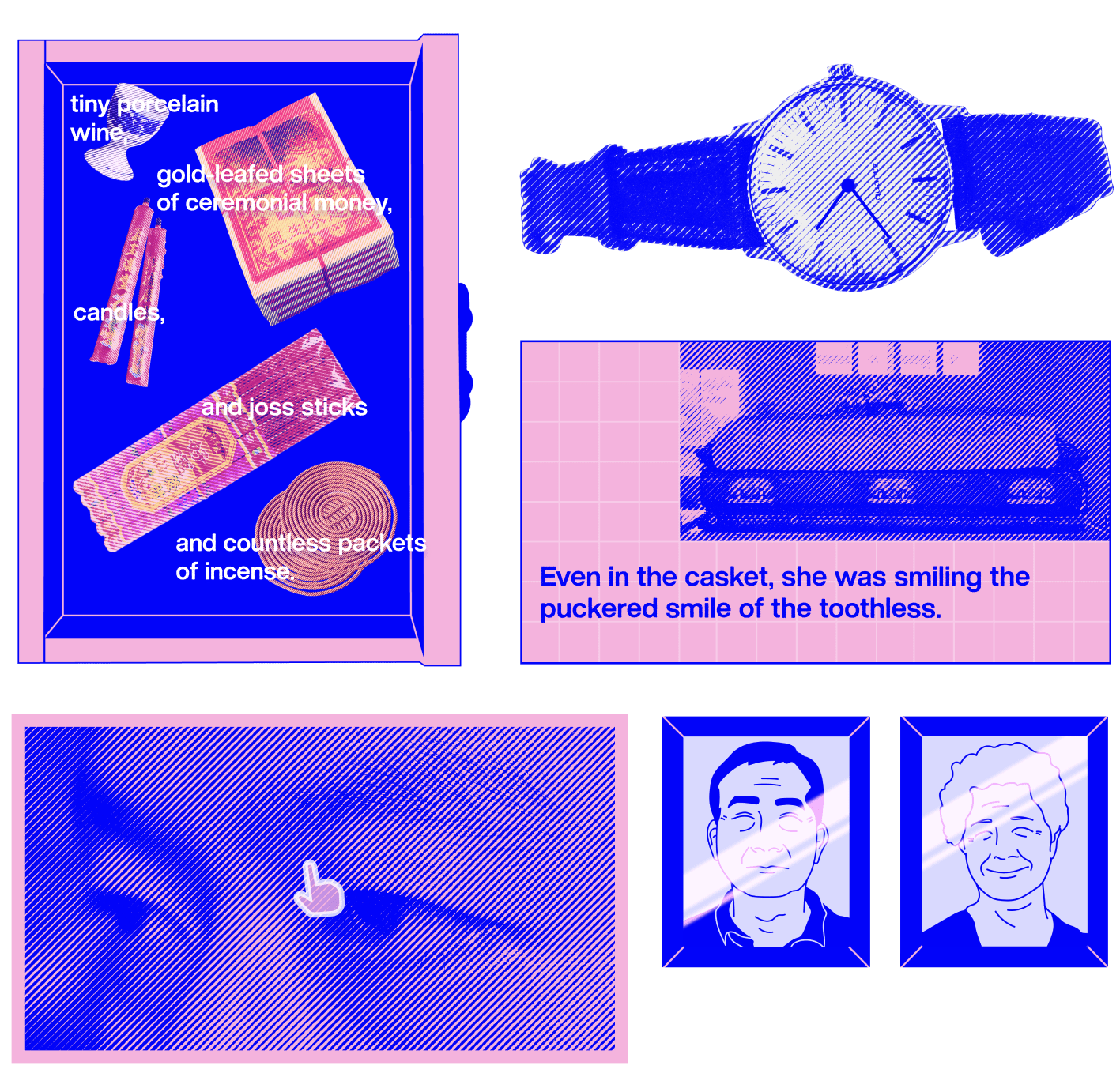
Close up on interactive components
Try the live website here!
Design Brief
Getting Gen Zs to read
Our target audience are readers aging 13-24 years old, readers with little interest in homegrown fiction and/or no awareness of Singapore’s literary arts scene, and international readers who are interested in literary arts.
Objective
The series little red comma hopes to ignite interest in Singapore fiction using the dynamic and interactive properties of digital media,
The Story
“Tanjong Rhu” is a short story about the relationship between Mr Li, asuccessful businessman, and his mother, Ah Ma. The writer describes this story as anattempt to understand the loss of her grandmother from her father’s perspective.
Brand Identity
Brand Proposal
For the first 2 weeks, I focused on finalizing the overall visuals of the website. I proposed a branding deck which consists of a key visual (thumbnail and pattern), font pairing, and color scheme.
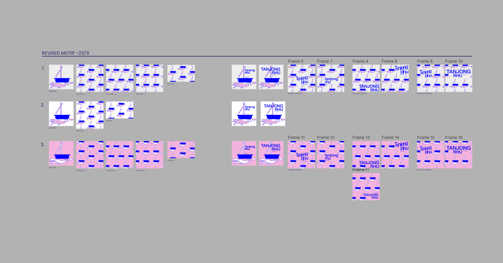
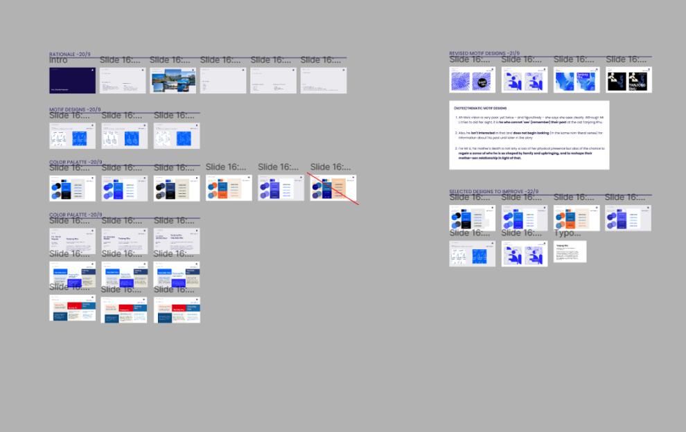
Proposed Drafts
I’ve come up with a few options on the brand proposal with different theme and key visuals. These were rejected, and we went with the pixelated pink key visual. Which really resonates with my personal branding!
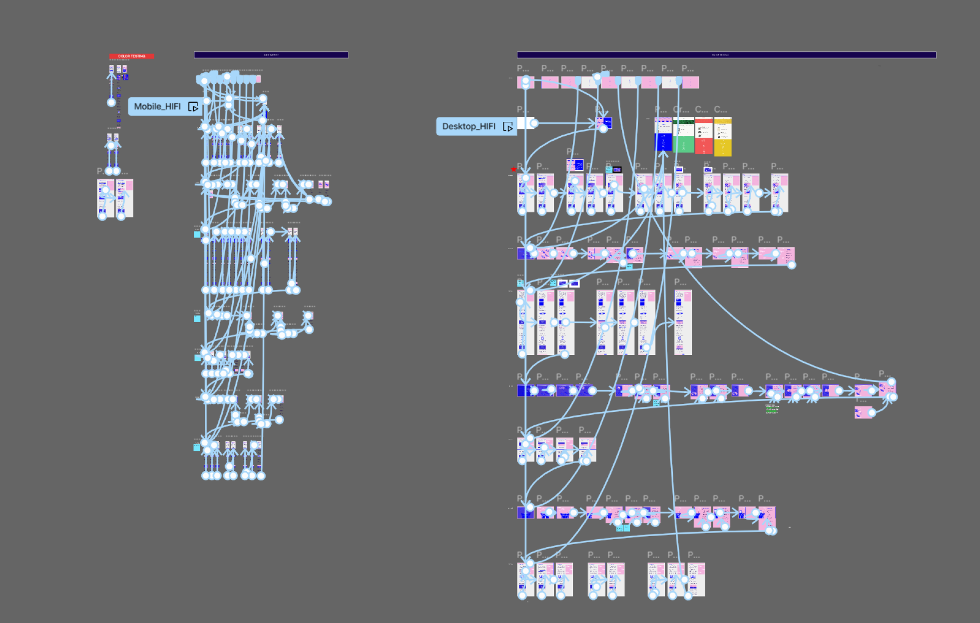
Userflow
Reading experience
Once the key visual is approved, I created a userflow chart for the entire microsite based on the flow written on the brief. This was mainly for the web developer’s reference.
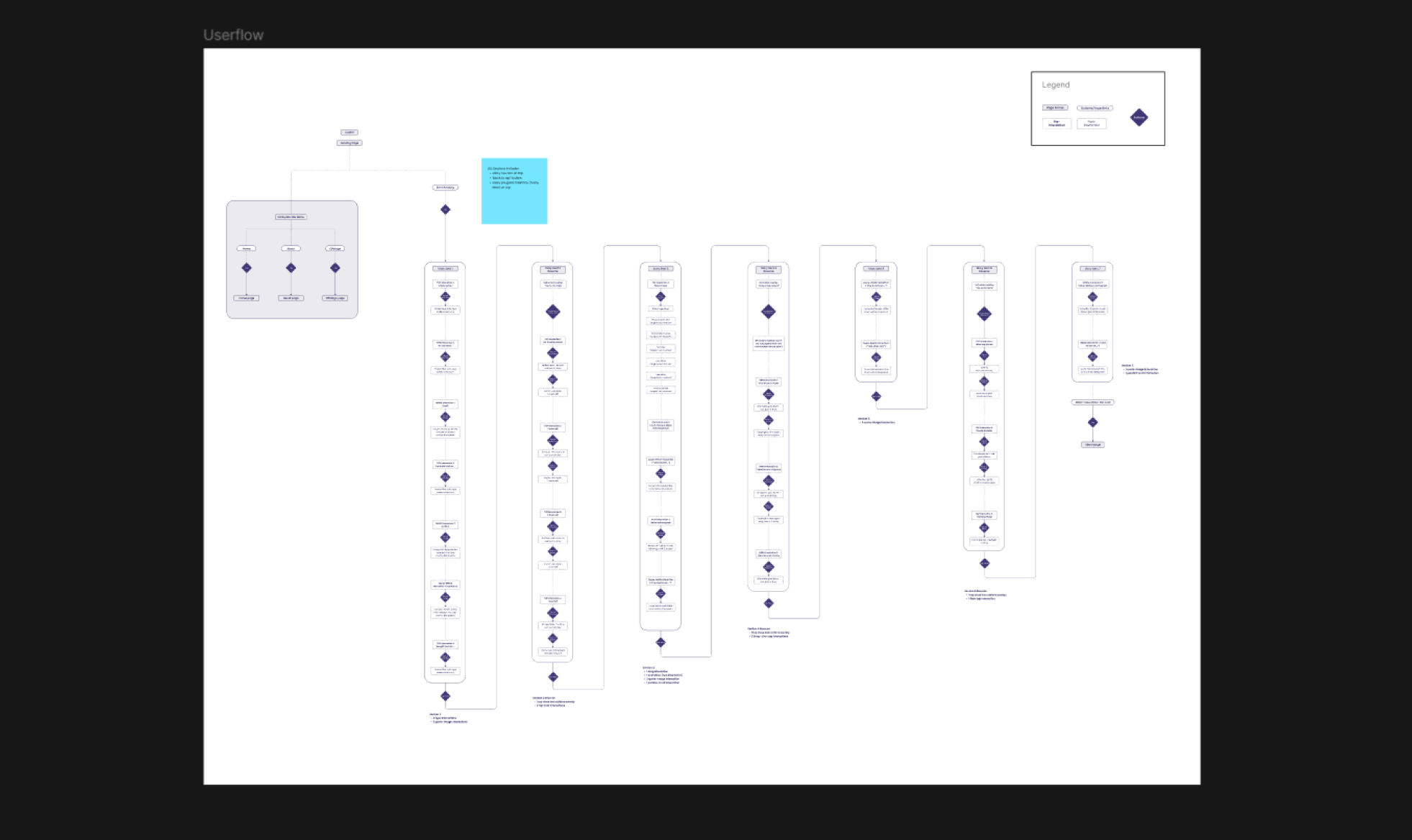
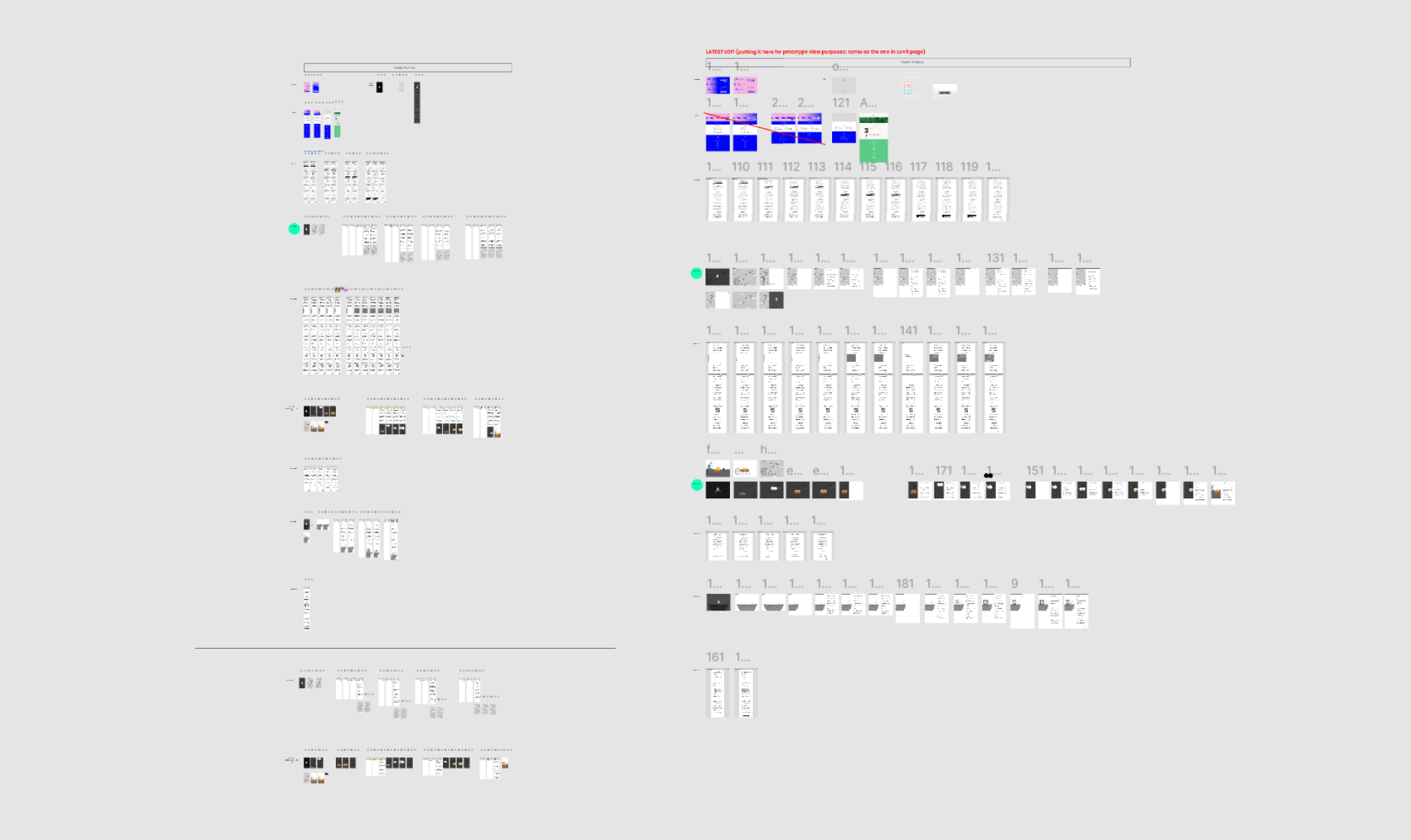
Low Fidelity
Mobile & Desktop
I started off with doing the mobile version, and had to draft out two options of the lo-fi prototype. Then Tusitala team and I would decide on one, and iterate it. Once I was given the green flag, I proceed with designing the desktop version of the lo-fi prototype.
User Interaction
Prototyping Interactions
While the brief has highlighted specific parts that require interactions, I had the freedom of coming up with ideas on how the interaction plays out! I had a blast brainstorming, prototyping and communicating with the web dev to make sure it’s still possible.
Design System
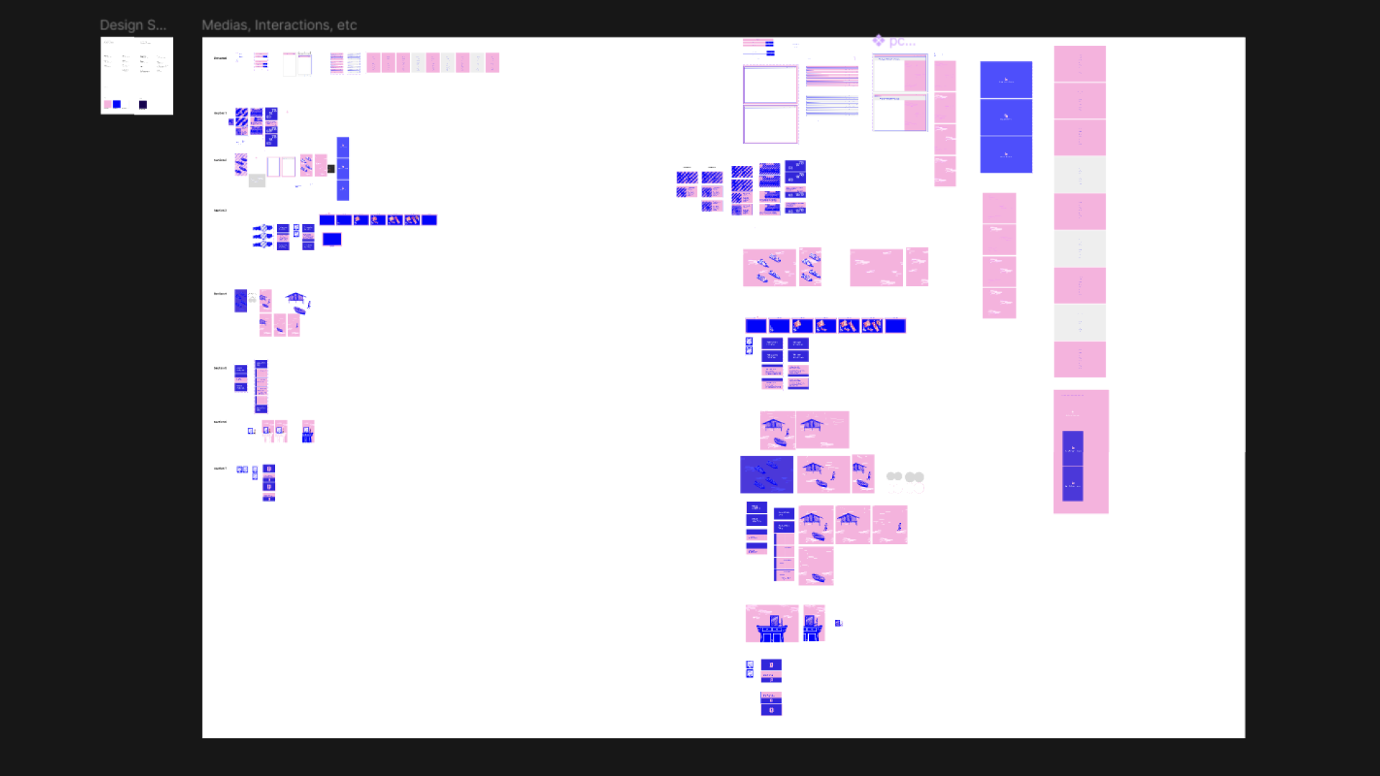
Creating from scratch
Aside from designing the typical UI components, I had to create my own visuals that match according each part of the story. I used stock images and photoshopped them to fit the branding of the key visuals better. There were some assets that I had to illustrate on my own.
Lessons learnt
Reflecting on the project outcome
Being able to take work with a literature piece was something I’d never thought about as a designer. Especially having to adapt the piece into a digital interactive microsite, I had more freedom in expressing my creativity..
International Client
As someone who had just started freelancing, I was initially overwhelmed at the fact that my client is from overseas. It was a new experience to be able to work with them and adapt to their working culture.
Balancing Deliverables
I had to keep track of my weekly goals and not fall behind deadlines. I found myself spending way too much time in creating the key visuals, which had held me back from proceeding to the next part of the project.
Background
I Need Space
UI/UX • Indie Game • Shipped
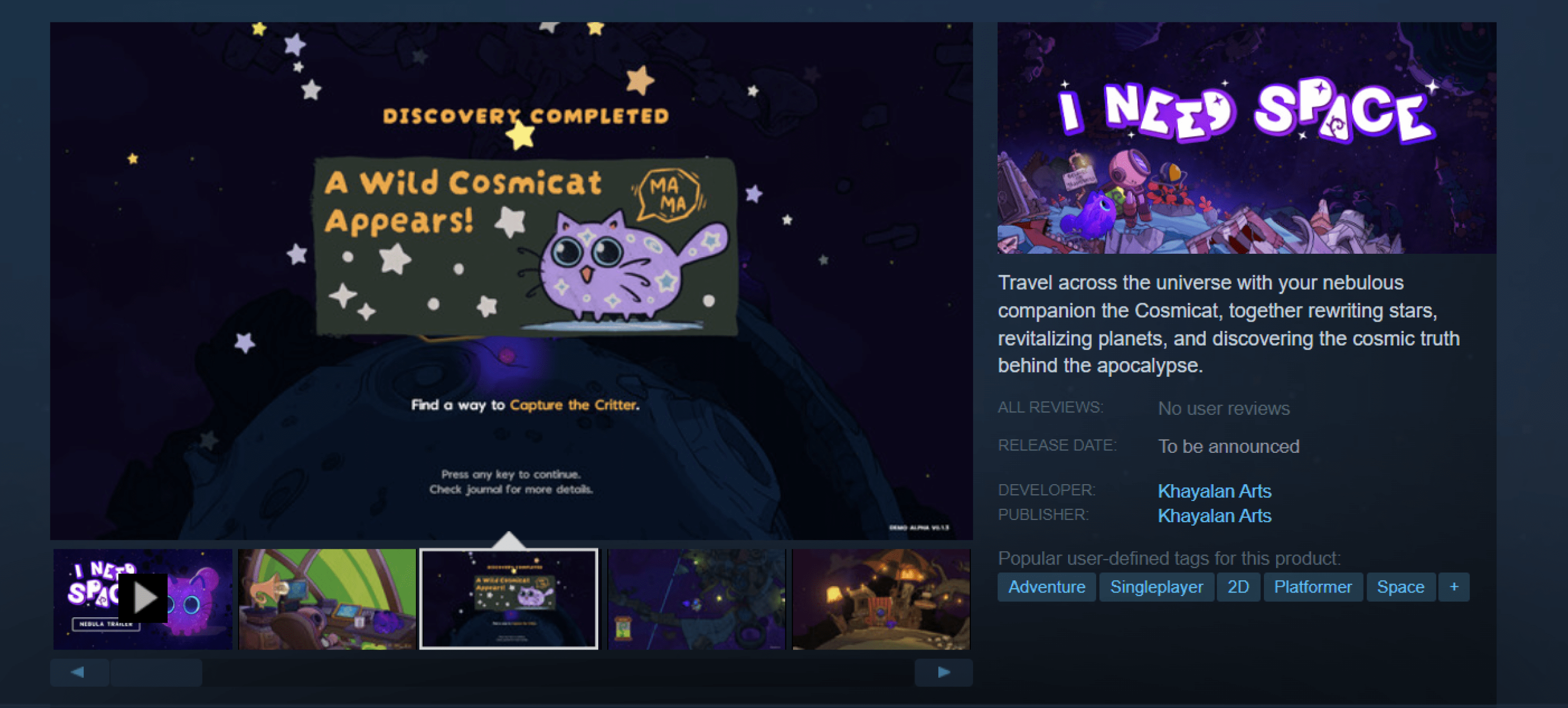
Working with an indie game company was one of my milestone as a designer. I worked on the early stage of the game "I Need Space". I'll be showcasing the early designs of the game which have been iterated and no longer in use in the current game DEMO.
View the game demo on Itch.io or Steam
Working with an indie game company was one of my milestone as a designer. I worked on the early stage of the game "I Need Space". I'll be showcasing the early designs of the game which have been iterated and no longer in use in the current game DEMO.
View the game demo on Itch.io or Steam
Role
UI/UX Designer
Timeline
October -
December 2022
December 2022
Overview
The Game Studio
Khayalan Arts is an Indonesian creative studio that promotes eco-friendly, cultural & positive social values via visual & interactive storytelling.
The studio has previously launched a game called "Samudra", and a webcomic called "Project: Press Play"
My Responsibilities
As a game designer...
I joined this project in its early stages, when the only solid foundations were concept art and art direction.
Meeting the team
I took sometime to understand the roles of the team members I will be working closely with, and learn to collaborate with them.
Breaking down the concept
I attended meetings with the game director/studio head to further conceptualize the branding and direction of the game, while pitching a few proposals to the team.
Design & Prototype
After creating moodboards and pitching a few ideas in mind, I proceeded to create drafts and prototype on Figma. Once they were finalized, I proceeded to design the on Adobe Illustrator to handover to the game developers.
Game Testing
For every progress that were made, a quick game testing is held during meetings to show the team. There, I was able to obtain feedbacks from everyone and continue to iterate on the UI.
Released Demo
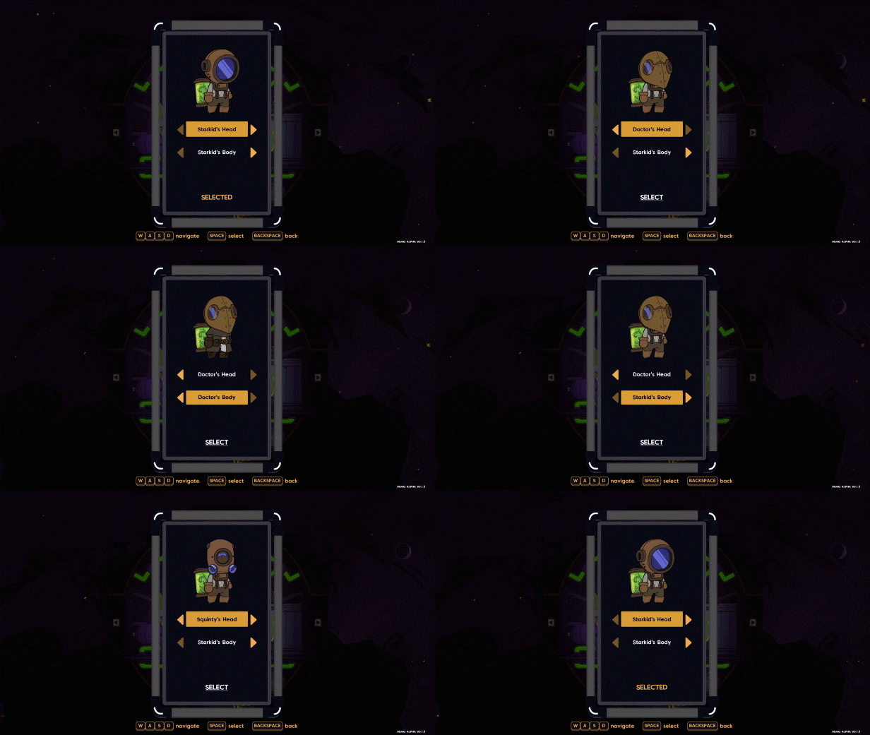
Game visuals
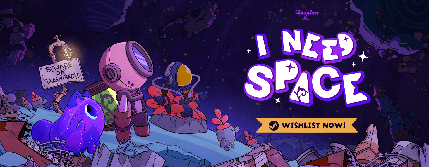
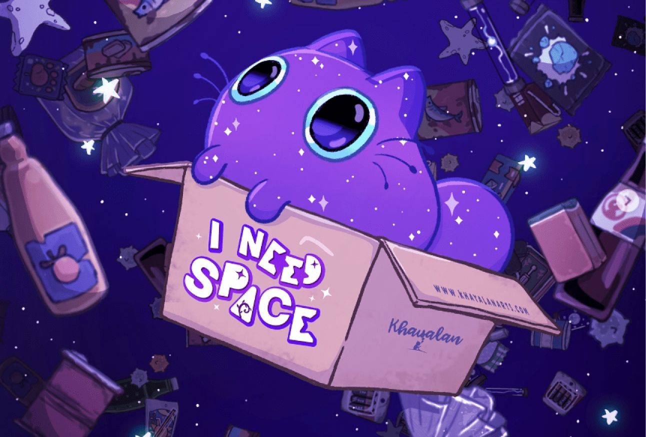
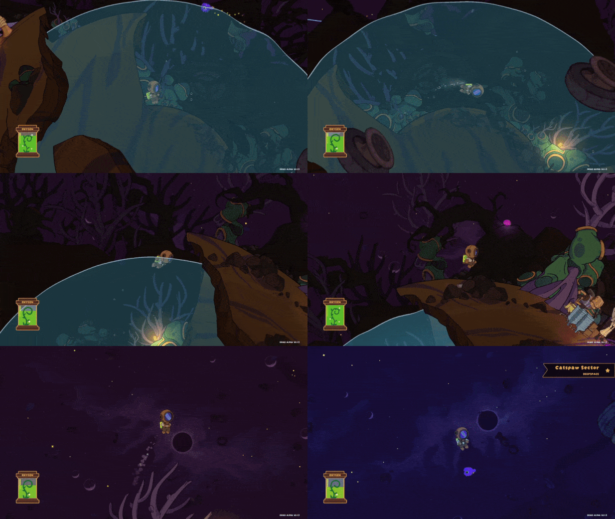
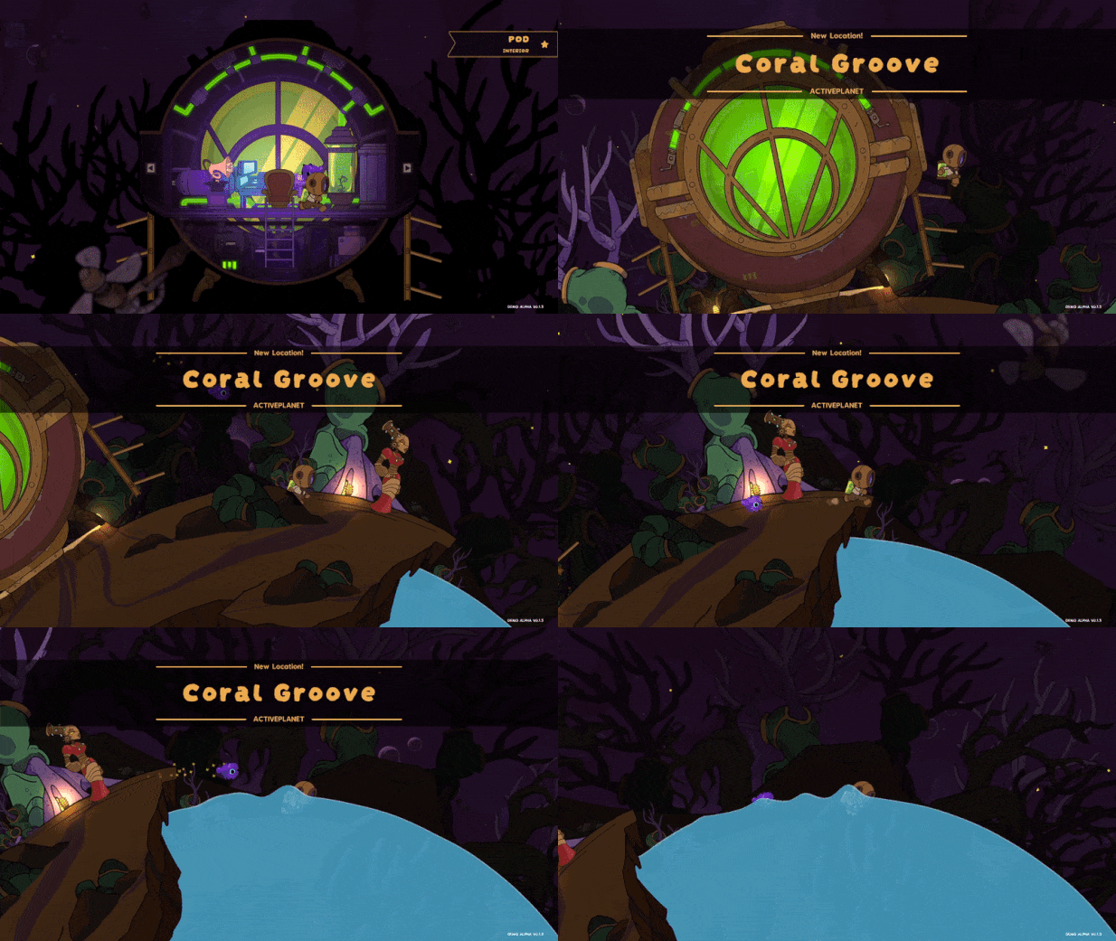
Here are some snippets of the interaction and visuals from their Itch.io page, to which I contributed. The logo is also created by me!
Research & Proposal
Task
I was tasked to research and brainstorm the designs for the following: Logo & fonts, Splash screen, Oxygen tank, Menu/Quest book, Closet, Speech icons.
Proposal Deck
After doing my research on released games, I used the concept art to propose a few design ideas. Here’s an example of a proposal I made for the Oxygen tank.

Low Fidelities
Wireframes & Iterations
Once I've received a green light on the proposal deck, I started working on the wireframes while receiving helpful inputs from the Art Director and developers.


Delivery
Mock Up
Using Adobe Illustrator, I created a high fidelity design mock up to hand it over to the developers. I had to make sure that the colors scheme and typography have been finalized.
*Note that these are early developments of the game, further changes are made in the released DEMO.
*Note that these are early developments of the game, further changes are made in the released DEMO.


Project Recap
Reflecting on the game outcome
I had such a blast working with people who are passionate in gaming. As a gamer myself, it was a new perspective to be able to work behind the scenes for the game instead of playing it.
A Different Approach
When it comes to designing for game UI, it takes on a different approach than a typical mobile or web UI. Additionally, it takes a while to do game testing it as the developers takes some time to code them.
Thinking Differently
I've learnt new things when it comes to designing for games. It was initially quite intimidating having to experiment where UI are being placed, their behavior and how it could impact the gaming experience.
Experience
SixtyTwo
Product Design • Internship • Overview
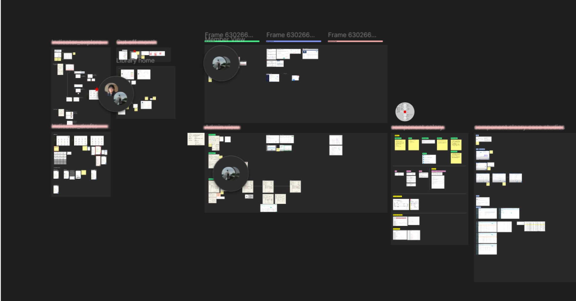
Before my school semester started, I had the opportunity to work with SixtyTwo as an intern. This case study shows my main learnings, and a compilation of my exploration on my own Figma file. Contact me if you're curious about this work ;) I'd love to yap about this!
Before my school semester started, I had the opportunity to work with SixtyTwo as an intern. This case study shows my main learnings, and a compilation of my exploration on my own Figma file. Contact me if you're curious about this work ;) I'd love to yap about this!
Role
Product Design
Intern
Intern
Timeline
May - August
2023
2023
Overview
The Company
SixtyTwo is an independent design and strategy studio based in South East Asia. that aims to build meaningful products, services, and strategies.
Project Assigned
I was allocated to a team working on a Software-as-a-Service (SaaS) product targeted for businesses (B2B), where I worked closely with a senior Product Designer and Project Manager.
My Responsibilities
As an intern...
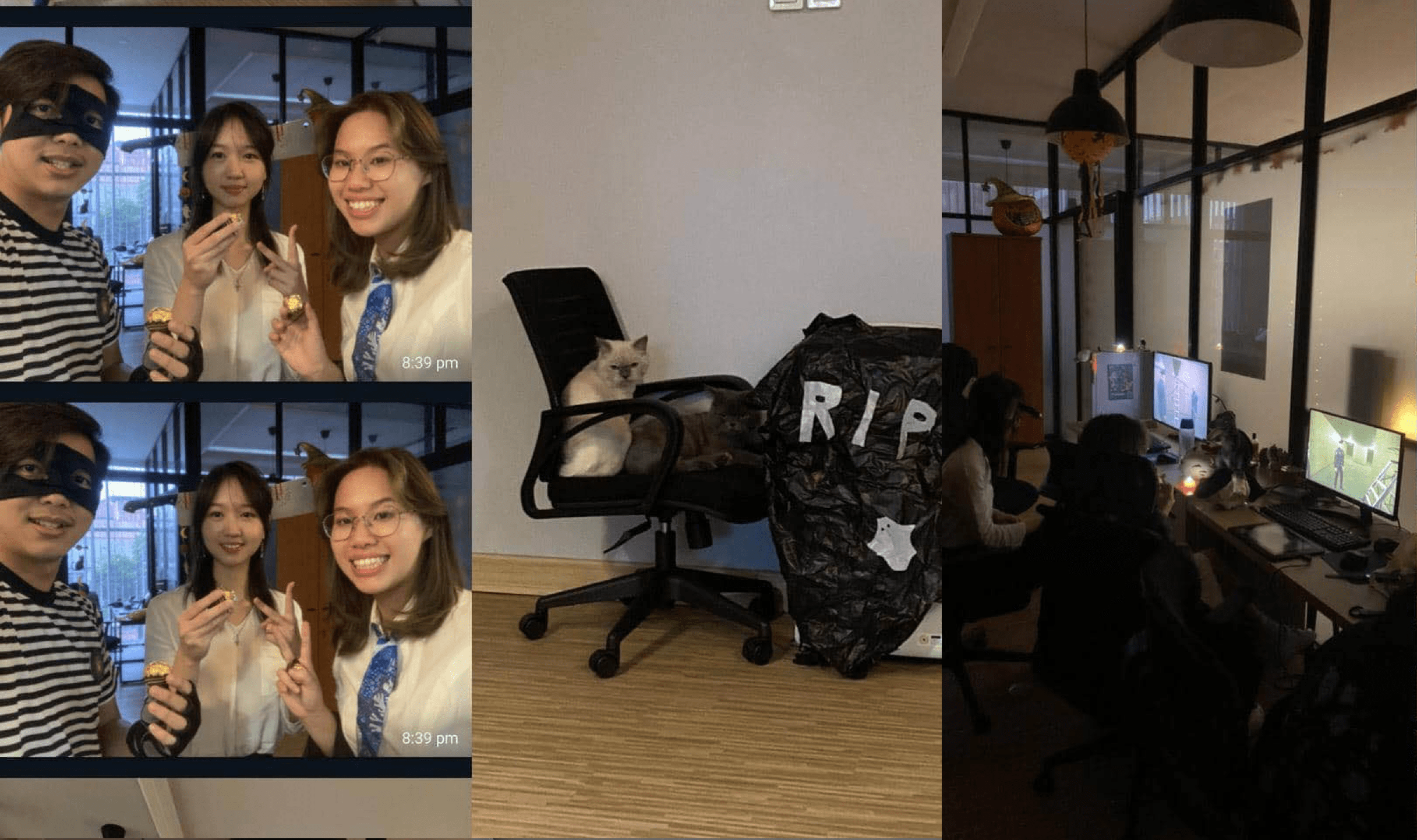
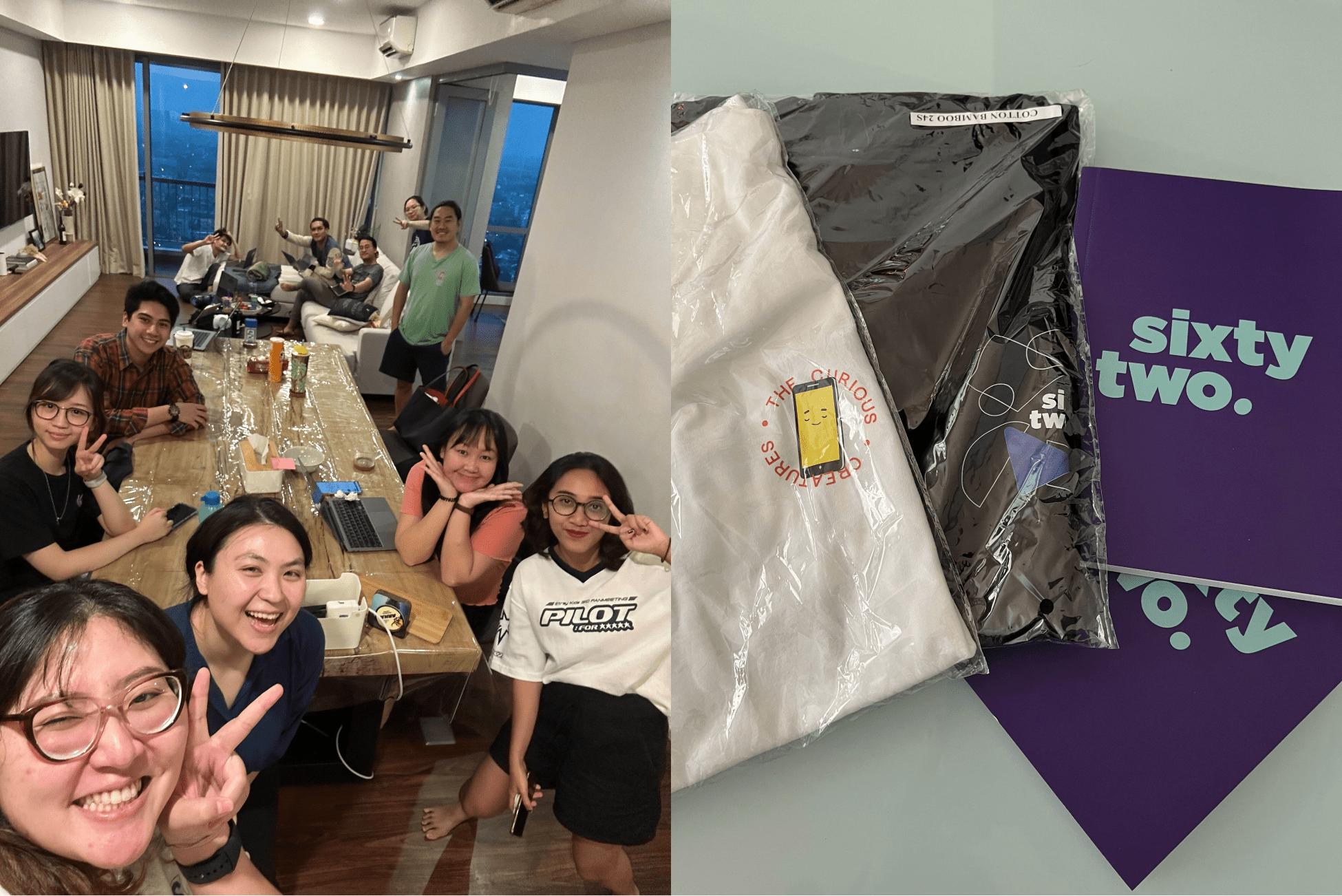
Working in a small design team of three has given me the opportunity to get closer to my colleagues and gain a mentorship-like experience.
Onboarding
Since the project has already started, I had to go through a lot of documents to first understand the product, it’s purpose, and users. I had also tried out the MVP that was already created for the internal team as part of user testing.
Research
There was a lot of background researching for me to begin with as I had no context of the product. For example, a payroll feature, I had to look into the Indonesia’s taxes, wage benefits, how a typical HR setup a monthly payroll, and many more!
Design & updating design system
I used the existing design system create new high-fidelity screens and prototype them on Figma. I’ve worked on, and made updates to the design system.
Gaining more insight
I continued reaching out to potential users of the product, mainly the founder and HR of this design studio. Pitching and demonstrating the flows I’ve created and continue iterating on them based on feedbacks.

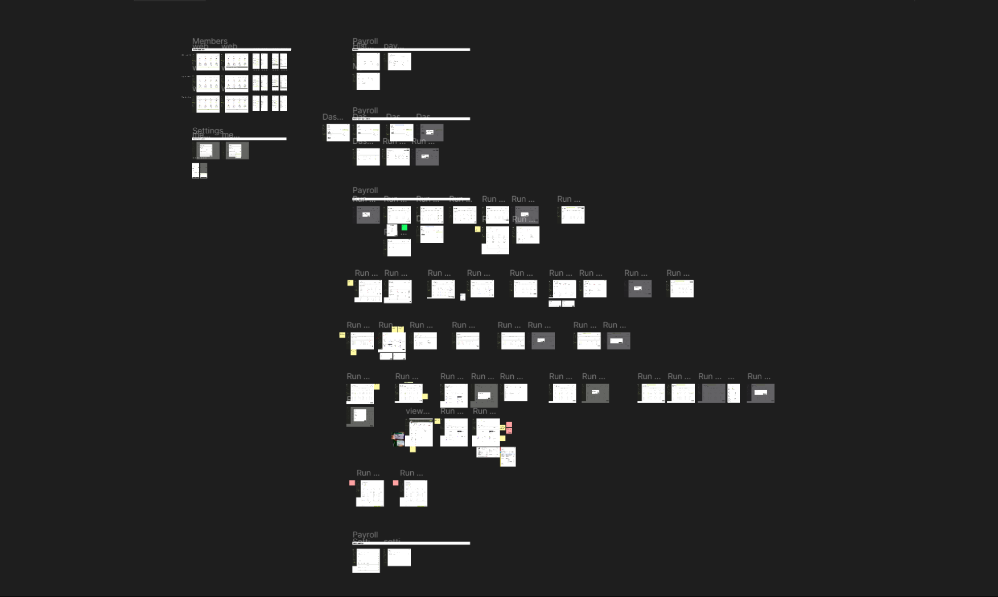
Internship Recap
My experience working in a design agency
My initial impression of a design studio was for them to be hectic and stressful. However, I had a wonderful experience surrounding myself with a lot of creative people!
Knowing when to take the next step
Working on this product wasn’t easy, I found myself having to go back and forth with my ideas since there were holes of information I’ve yet to fill. I made more handwritten notes than I’ve expected before imagining a wireframe sketch in my head.
Being more confident
In the beginning of my internship, I found it quite challenging having to rationale my work to the team since I wasn’t confident with the ideas I had in mind. My team gave me a push and guided me throughout my design process. I’m working to be more confident on the projects I’ll create in the future.
Background
The Circle
Product Design • Personal Project • Hackathon
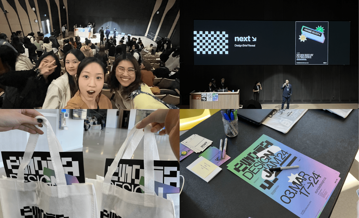
At the end of my first year at Emily Carr, I decided to team up with a few people from a student-led hackathon I was involved in to compete in another hackathon called Eunoia Design Jam. There were roughly 40 teams of 4, and we were given <4 days to complete the design sprint for our client UX Was Here. My group members are Firm, Kimmi and Maya.
At the end of my first year at Emily Carr, I decided to team up with a few people from a student-led hackathon I was involved in to compete in another hackathon called Eunoia Design Jam. There were roughly 40 teams of 4, and we were given <4 days to complete the design sprint for our client UX Was Here. My group members are Firm, Kimmi and Maya.
Overview
Problem
How do we create a vibrant and inclusive community for UX enthusiast while also increasing website usage rate?
Outcome
Our team designed and prototyped a new feature to increase user engagement, hence enhancing retention. While also allowing people to establish more meaningful connections.
Design Brief
From research to design & prototype in 3.5 days
UX Was Here strives to fulfill its mission of creating a vibrant and inclusive community for UX enthusiasts. However, they have an extremely high turn rate and a low utilization rate for the community website.
Day 01
After the opening ceremony, our team sat down to further understand who our client was and their goals. Our focus was to narrow down the target audience, and create a solution dedicated to them.
Day 02
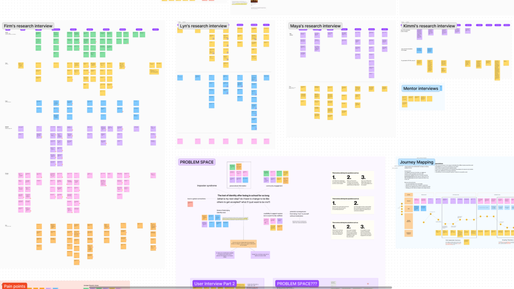
We researched and interviewed potential users to dig into the problems they are facing. While collaborating around the clock to brainstorm various solutions in addition to having a community website.
Day 03
We highlighted the consistent problem our audience have been facing and came up with a way of creating a positive and sustainable community space.
Submission
We updated the client’s outdated branding, designed, prototyped the features we proposed, and created a 5-min video pitch. And, included a business model to backup our solutions for the client in the presentation deck.

End results
Final application
design & solution
design & solution
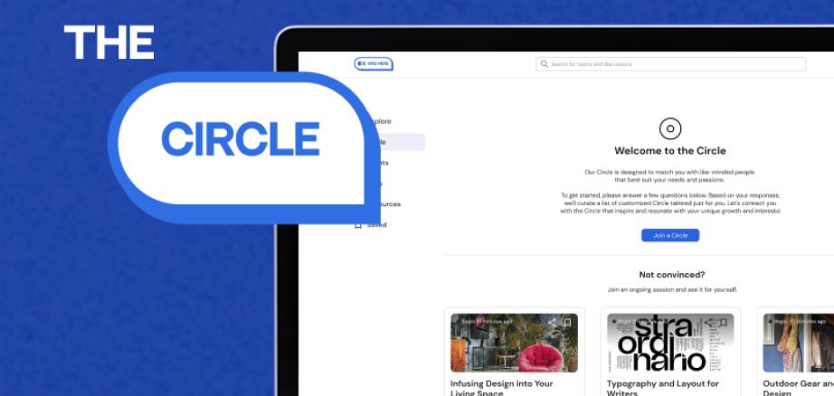
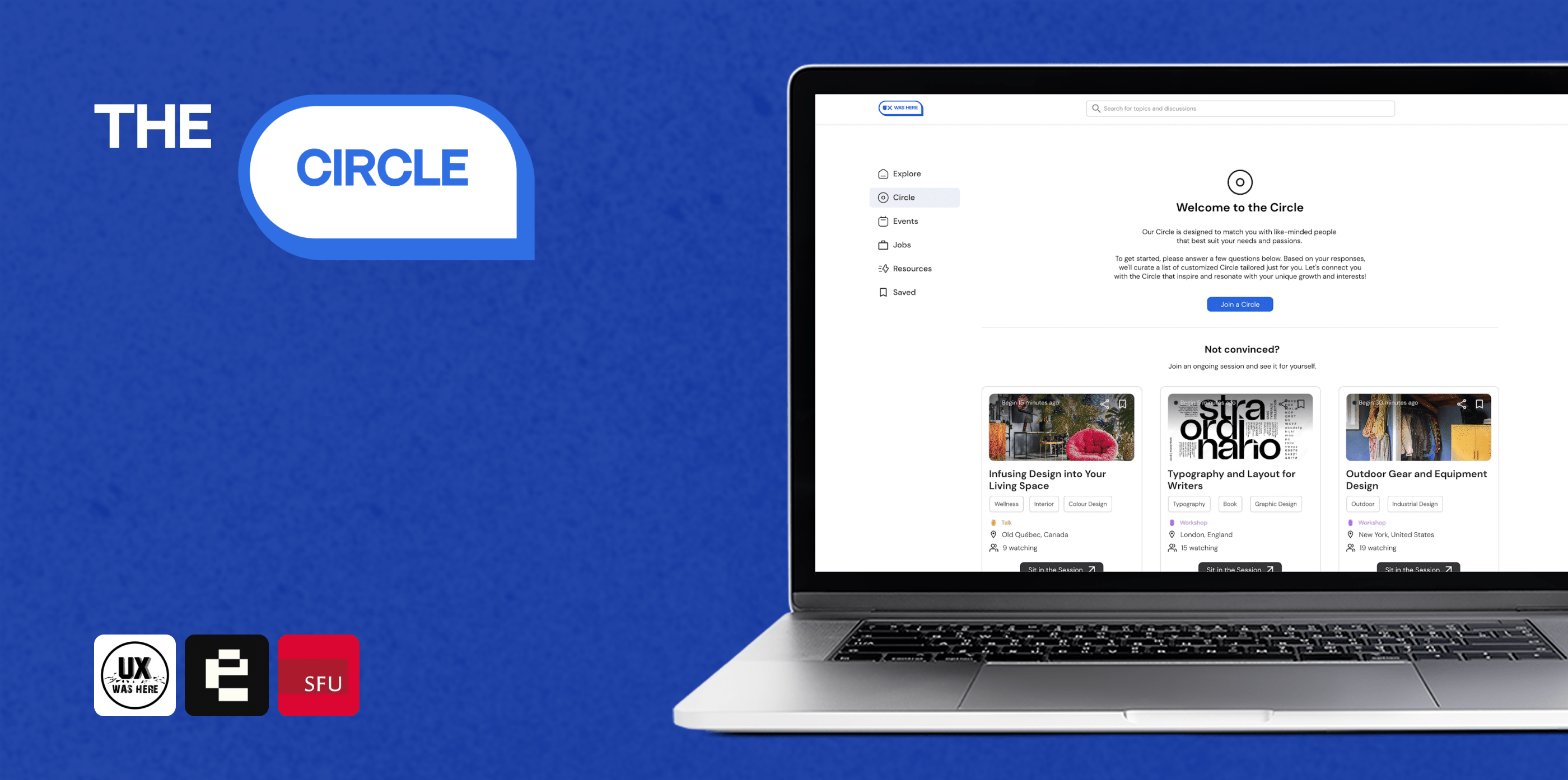
My team came up with a new feature for UX Was Here community website.
Onboarding Questionnaires
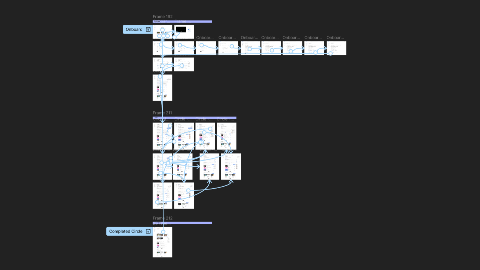
To ensure The Circle provides the user with the best possible group matches, the system asks a list of questions to curate the optimal Circle users can find the best connection and grow the most in.
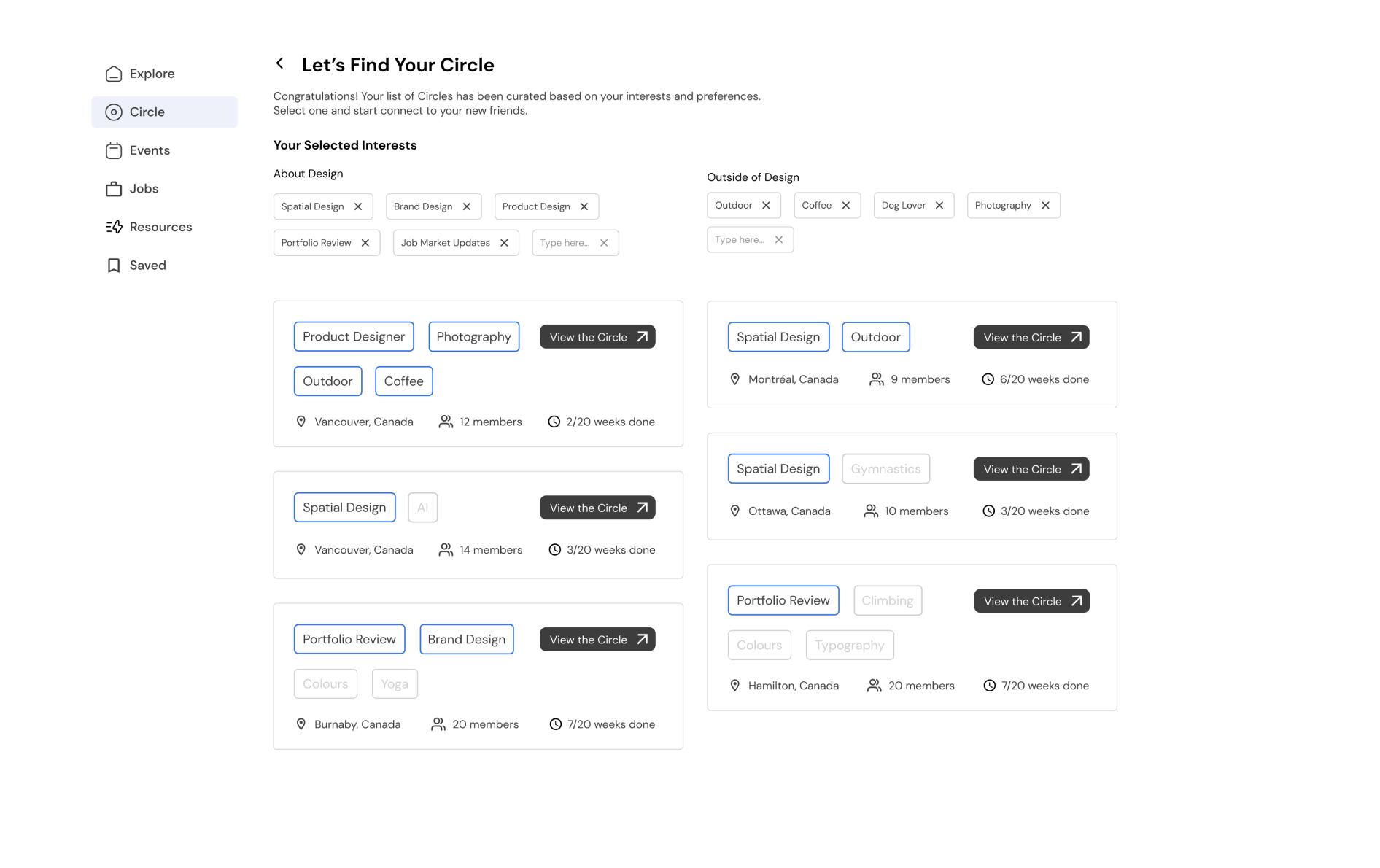
Find Your Circle
Based on the input users gave during the onboarding process, the algorithm would provide lists of Circles for user to select and compare.
Organize & Vote
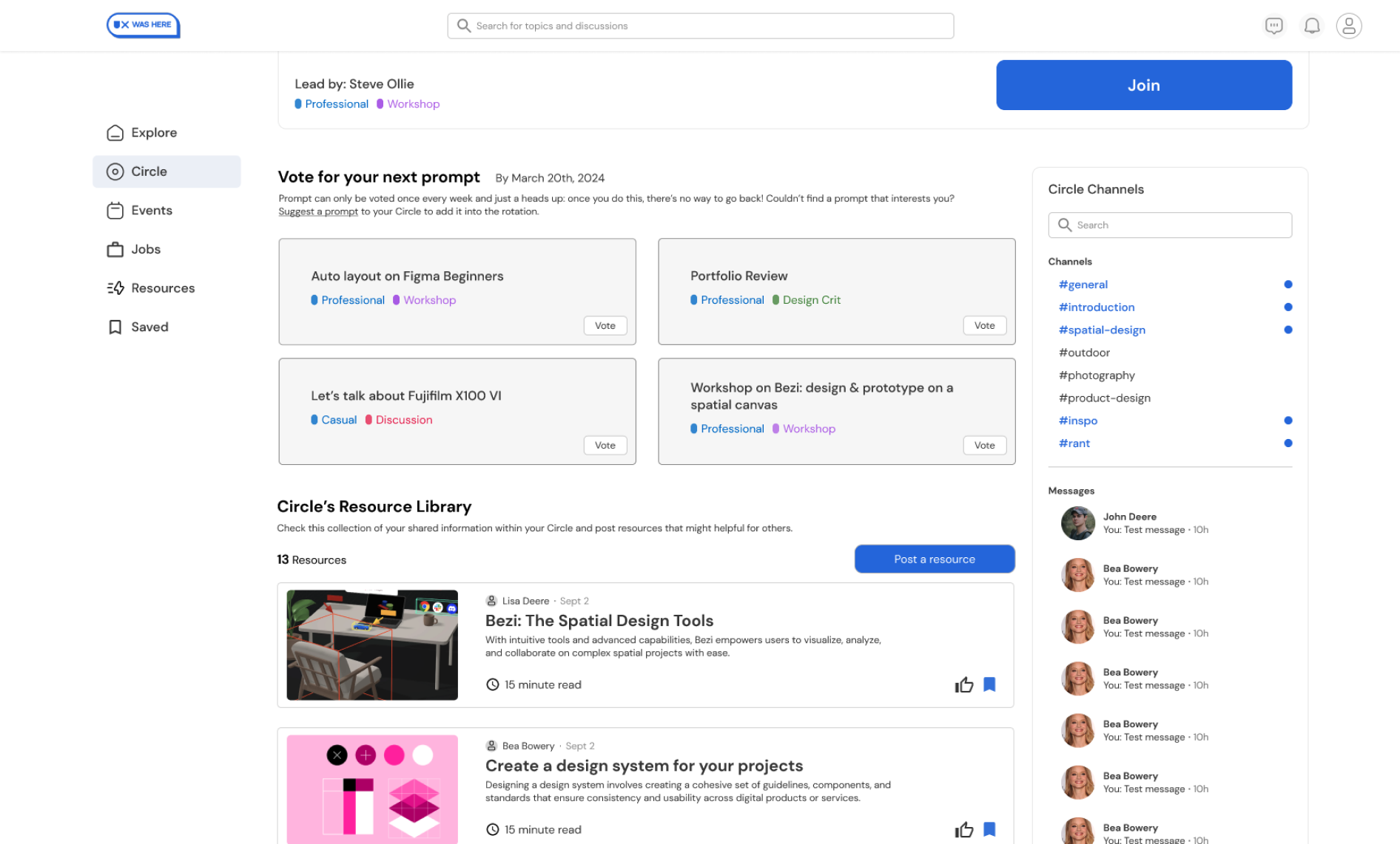
Users have the power to organize, share & vote on the next social prompts to enhance any skill they are interested in.
The prompt with the most members’ votes will pass as the next social topic .Prompts are randomly generated based on members’ survey input.
The prompt with the most members’ votes will pass as the next social topic .Prompts are randomly generated based on members’ survey input.
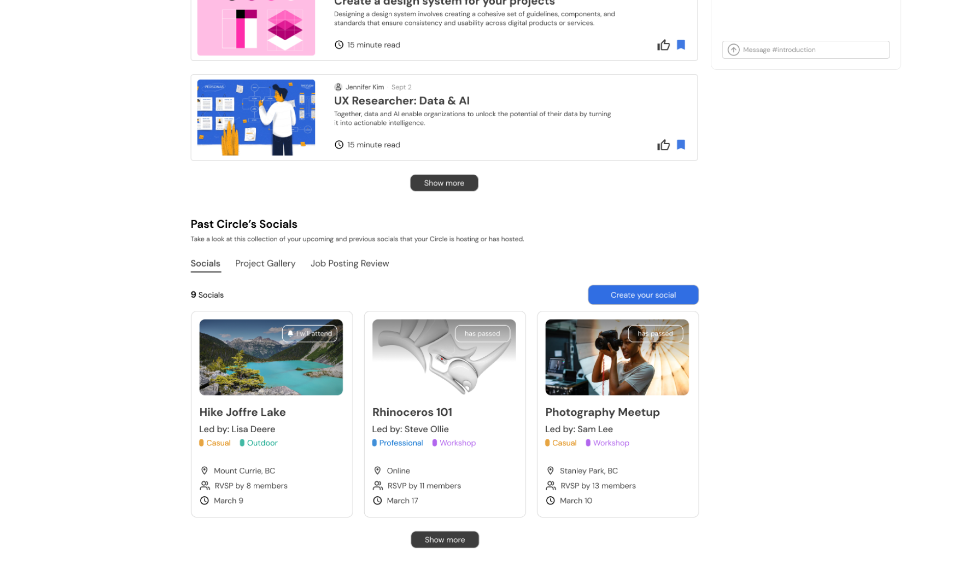
To Next Circle
Each Circle lasts for 20 weeks, then users will be put into a new Circle to build new relationships and learn new interesting skills.
Why 20 weeks?
Casual friends can become friends in 3 weeks, and there’s a 50% chance that friends will become good/best friends after spending 3 months together.
Why 20 weeks?
Casual friends can become friends in 3 weeks, and there’s a 50% chance that friends will become good/best friends after spending 3 months together.
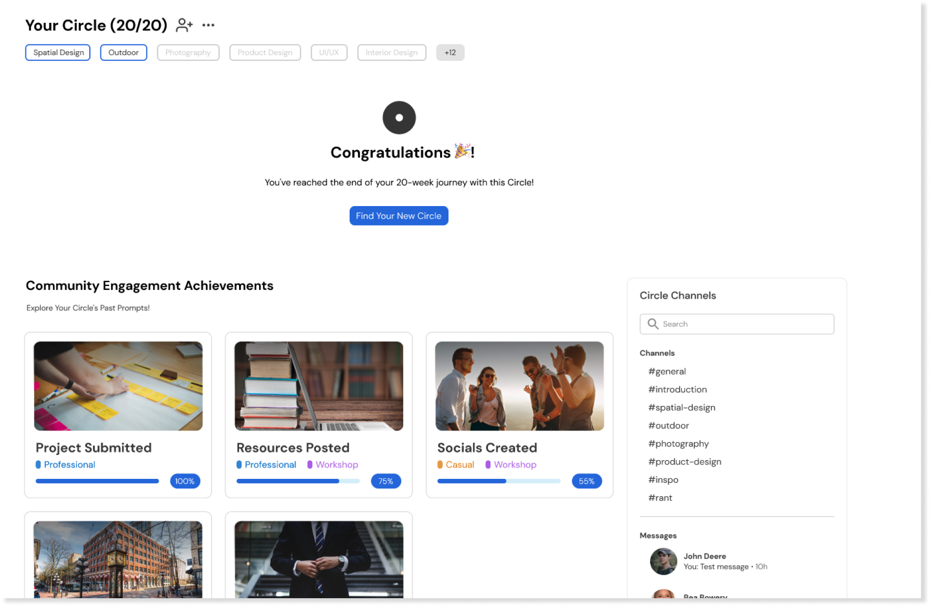
Try the prototype here!
Brand Enhancement
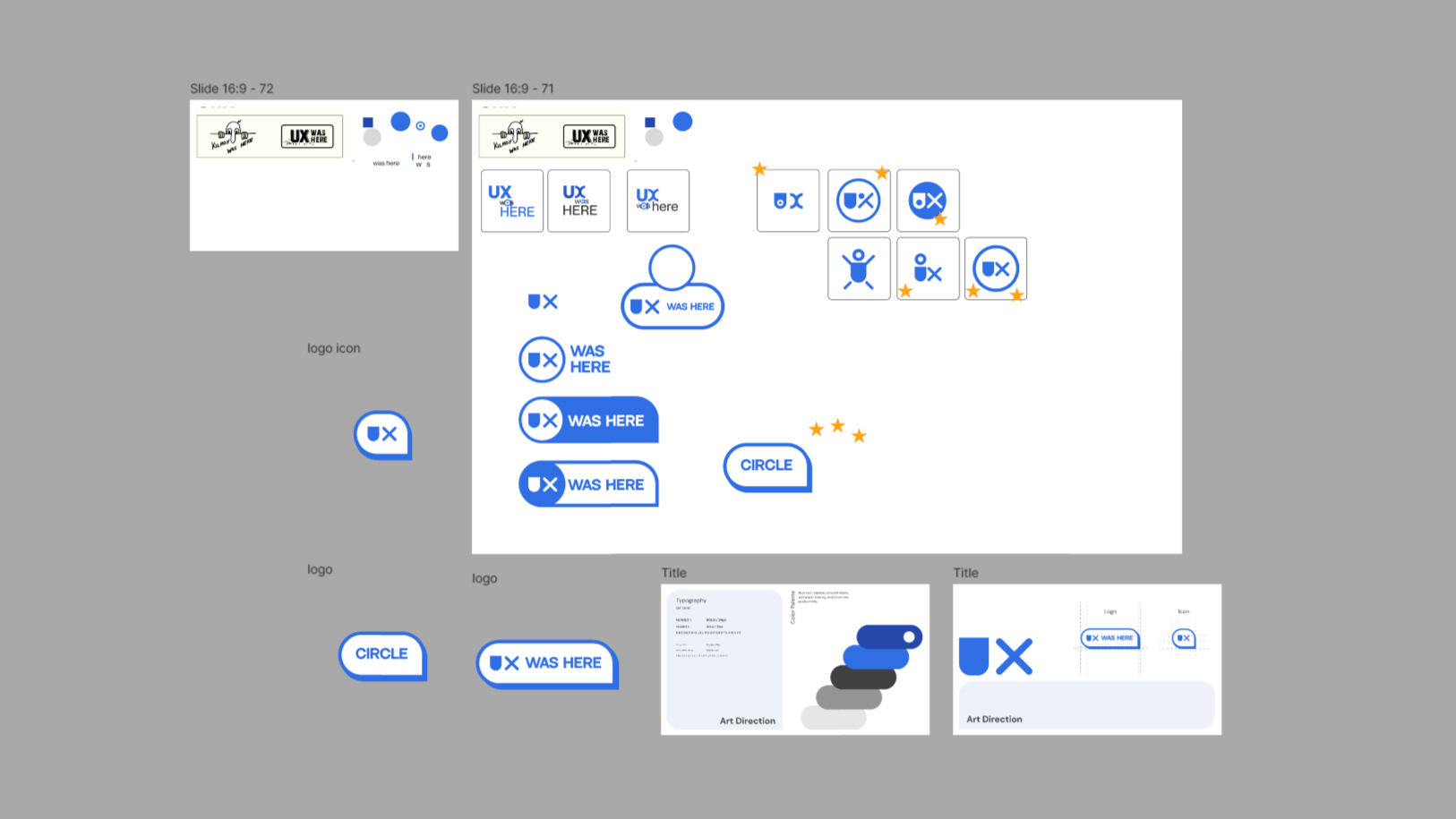
Updating the brand
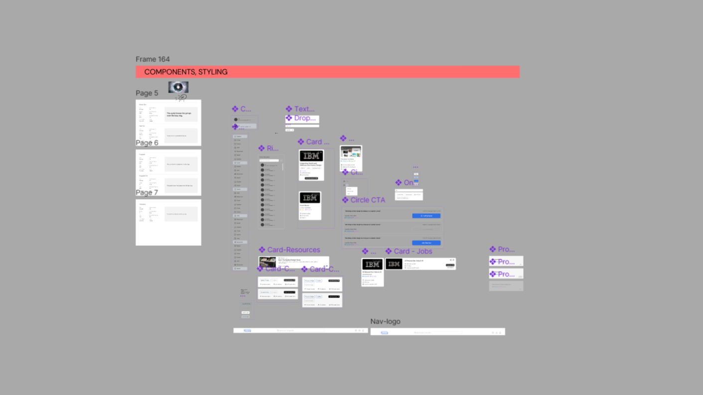
We created a new logo to create a fresh modern look which may entice our audience. We also made new design assets to add to their existing design system.
Low Fidelity
Team activity
& lo-fi creation
& lo-fi creation
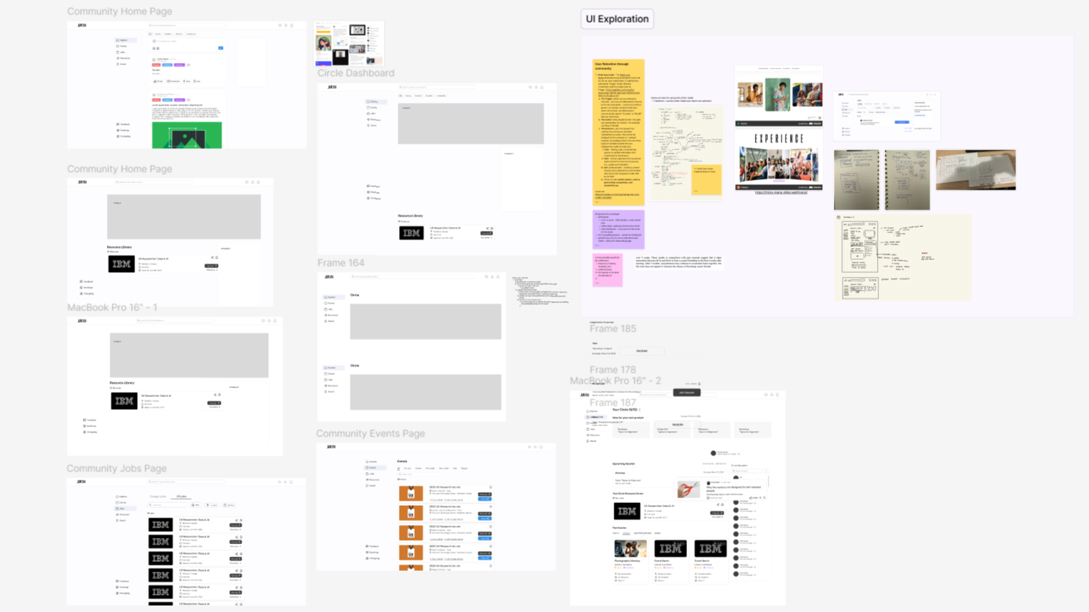
Due to the limited time, our team quickly came up with individual lo-fi screens based on a Crazy 8’s activity we did together. Then, continuously iterate from them, and pick them apart to build a single direction of lo-fi screen.
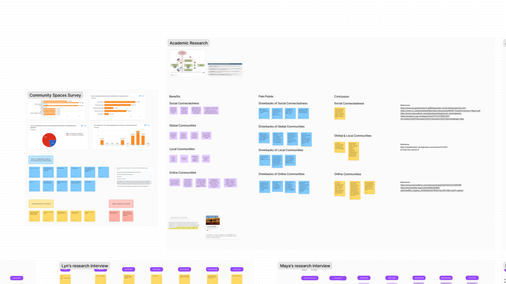
Understanding Communities
Why community space?
A survey results
A survey results
75% feels satisfied in the community they are and were a part in.
“...made me feel welcome and seen/heard, peers that became great friends, and activities that are fun or educational.”
Effectiveness & benefits
Social support enhances self confidence
Individual’s confidence in their abilities increases from social support, particularly in high-pressure situations.
Received support buffers stress
Community support mitigates the negative impact of stress on self-confidence
Engagement boosts retention
Our team designed and prototyped a new feature to increase user engagement, hence enhancing retention. While also allowing people to establish more meaningful connections.
Lessons Learnt
Reflecting on the project outcomes
This was my first hackathon experience and an intense one. I learned a lot from my peers and how to improve on my UX skills within a week of my term break.
Understanding Client & Brief
It was quite challenging for me to gather more data to brainstorm potential solutions for our client. After numerous primary and secondary researching, we still found it difficult to decide which path we wanted to take to propose a new idea.
Mentorship
My team and I were grateful for the feedbacks we’ve received from our mentors. It made me realize how important it is to have an industry professional perspective and guidance throughout this project. Huge shout out to Calvin!
Hi! I'm Sherlyn
I'm a UI/UX designer based in Vancouver, BC. Often find myself rambling & brainstorming peculiar ideas. Believes in the power of high-quality design; in providing value to others; in developing fresh and honest design solutions.
I specialize in crafting intuitive, user-centered interfaces that solve real problems and elevate the visual experience. Whether it’s a product, platform, or interaction flow, I bring clarity, functionality, and thoughtful design to every screen.
I specialize in crafting intuitive, user-centered interfaces that solve real problems and elevate the visual experience. Whether it’s a product, platform, or interaction flow, I bring clarity, functionality, and thoughtful design to every screen.
During the day...
Currently, I’m studying Interaction Design in Emily Carr. Previously the Creative Director of a student-led hackathon called FLUI (2025).
When I'm not designing...
I love playing volleyball and currently in the progress of getting my certification as a STOTT Pilates instructor while teaching Pilates part-time.
Internship
2025
Loading projects...
Looking for opportunities in the game industry!
Education
2023 - 2027
Bachelor's degree in Interaction Design
Emily Carr University of Arts and Design
GPA: 3.8
GPA: 3.8
2019 - 2023
Diploma in Graphic Communication
Nanyang Academy of Fine Arts
notbylyn
check out my X
♥ 100 likes
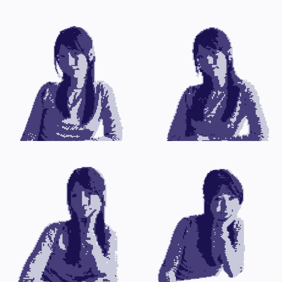
lyn designed a large deskmat #PixelArt
19 MAY 2024
♥ 100 likes
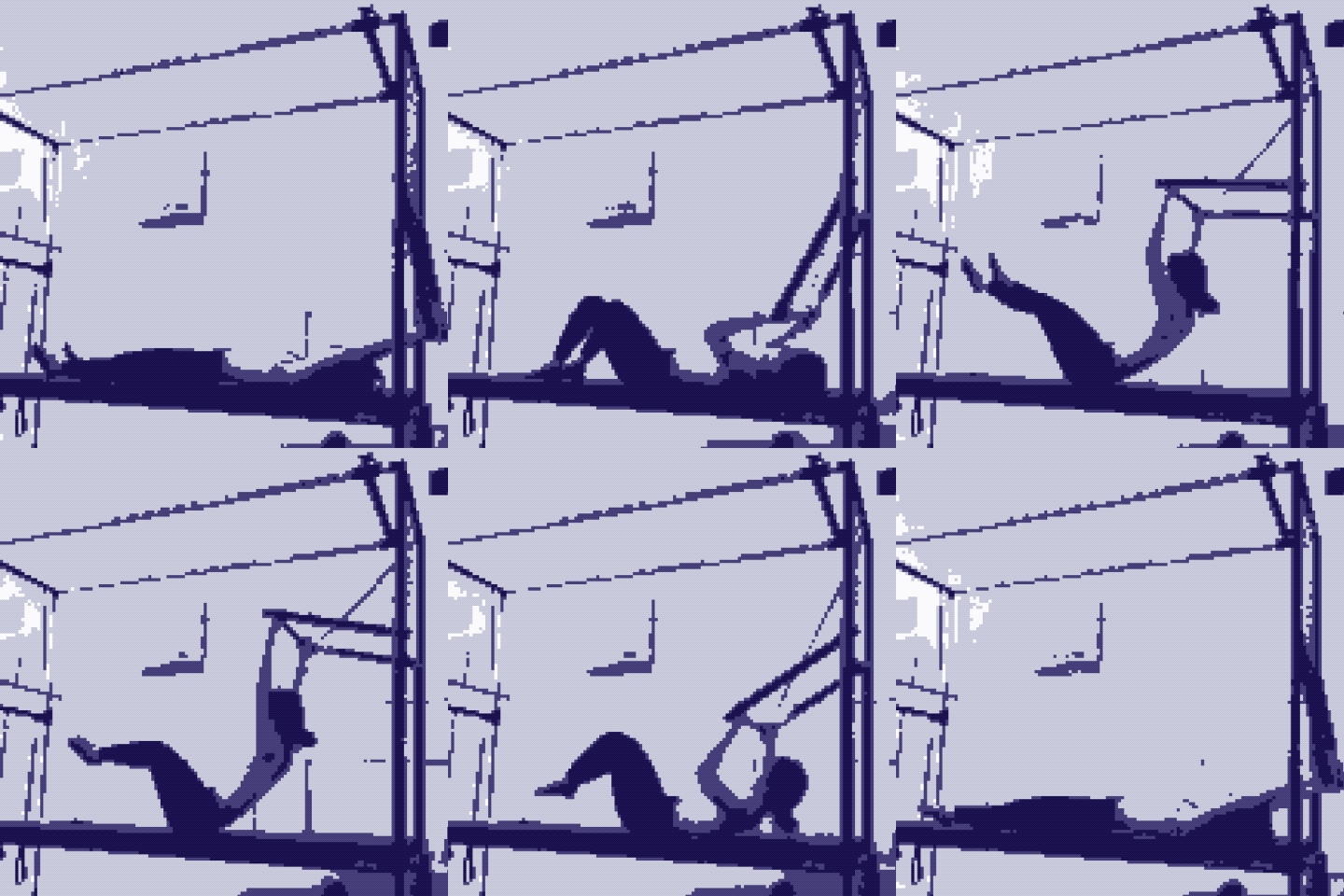
lyn trying to improve my posture #Pilates
5 OCTOBER 2024
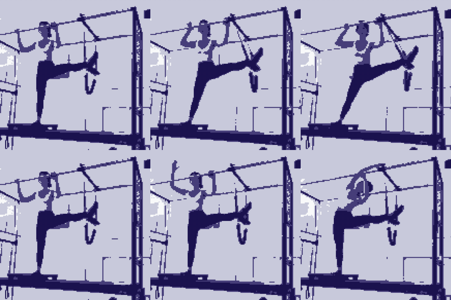
♥ 100 likes
lyn destressing #Pilates
5 OCTOBER 2024
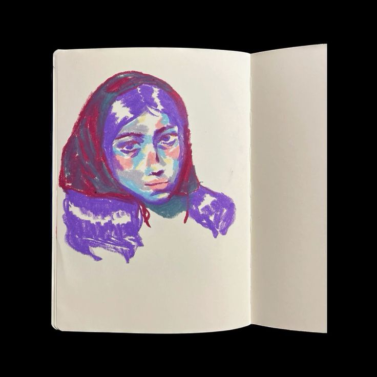
♥ 100 likes
lyn a girl with red hood #OilPastel
20 APRIL 2024
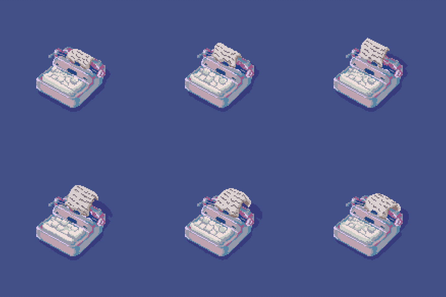
♥ 100 likes
lyn typewriter animation #GIF
16 NOVEMBER 2023
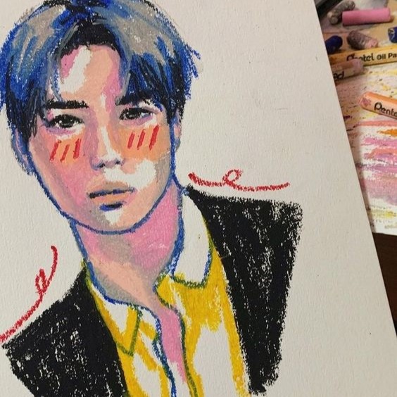
♥ 100 likes
lyn Jeno from NCT #OilPastel
20 OCTOBER 2023
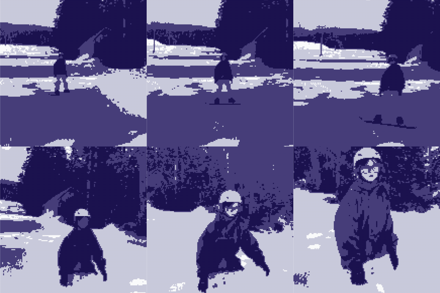
♥ 100 likes
lyn a beginner #Snowboard
25 MARCH 2024
♥ 100 likes
lyn experimenting for a poster #PixelArt
24 DECEMBER 2021
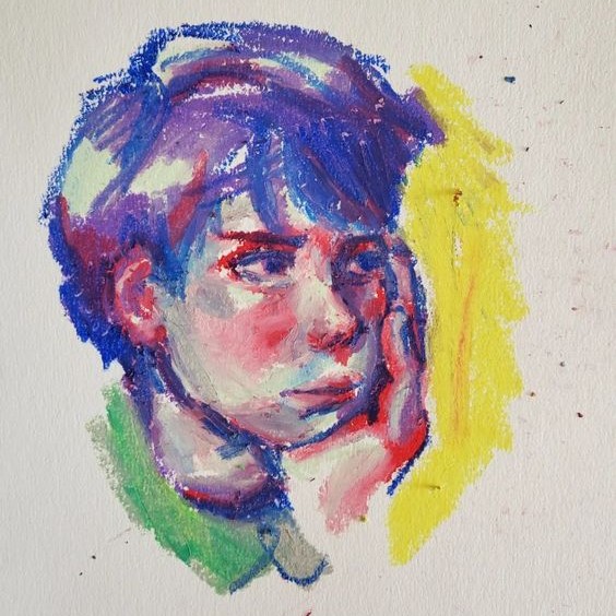
♥ 100 likes
lyn using more red #OilPastel
10 MAY 2022
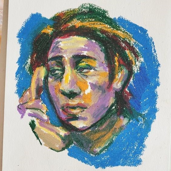
♥ 100 likes
lyn feeling a bit blue #OilPastel
17 AUGUST 2021
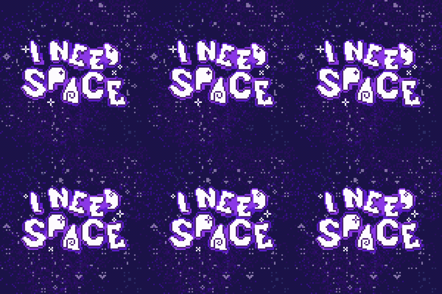
♥ 100 likes
lyn animated I Need Space game logo from my freelance project #GIF
15 OCTOBER 2022
♥ 100 likes
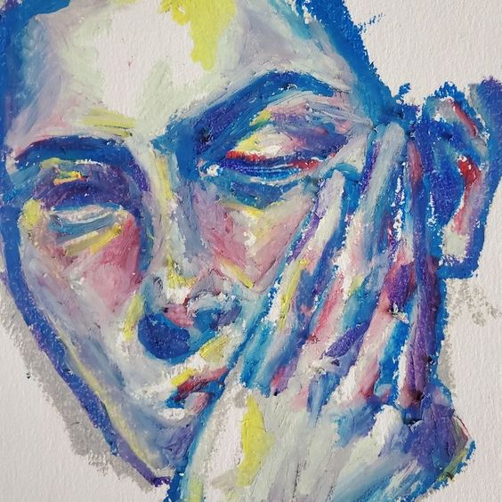
lyn love drawing portraits #OilPastel
20 JUNE 2023
♥ 100 likes
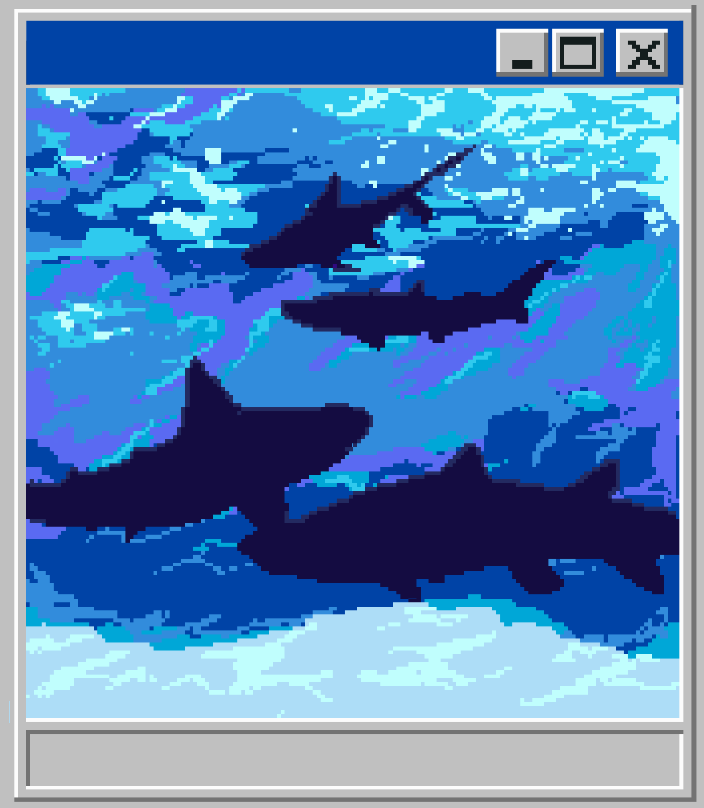
lyn drew a mousepad #PixelArt
20 DECEMBER 2022
